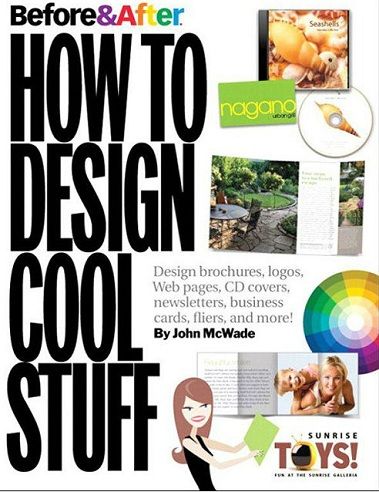
Before & After: How to Design Cool Stuff
By John McWade
Peachpit Press | November 2009 | EPUB/MOBI | ISBN10: 0321580125 | 240 pages | 22.7 mb
About the Author
Designer, teacher, and author John McWade has been at the forefront of the graphic design and desktop publishing worlds for several decades. The very first beta user of the desktop publishing program Aldus PageMaker, he went on to found the first desktop publishing company, PageLab, to take advantage of the new tools. With his partner Gaye McWade, he founded the acclaimed Before and After magazine.
CONTENTS
Knowledge
Design without rulers: Put away your ruler. Here's how to design the way you see.
The empty page has a lot to say: Don't fly past that setup dialog! It's where your design begins!
Our color wheel: The color wheel is our tool for understanding which colors go with what.
How to find the perfect color: The color palette you need is already hidden in the photo. Here's how to find it.
What typeface goes with that?: How to pick a typeface that complements a graphic.
How contrasts create type style: Using contrast properly can make or break your typographic design.
Typography 101: Type is a tool: Learn how to use it properly, and your work improves.
Character parts
Technique
Many from one: Big photos have small photos inside. Here s how to get several images out of one original.
More from less
Cropping basics: How to crop photos for function and meaning.
Background selection
Focal points: Complex or ambiguous photo? Eight simple ways to put the reader's eye where you want it.
Cool covers: Ten simple ideas for great-looking covers.
How to design a second page: You 've designed a beautiful outside. How do you follow it up inside? Simply. -Bring the outside In
Simply borderless: How to design pages for desktop printers that can't print to the edge.
Voice-over captions: A caption can be much more than a label. Here s how to get it onto your picture and into your story.
Multl-captlon photo tells many stories
Multiple captions In high style
Lessons from a beautiful site: The University of Miami College of Arts & Sciences shows that beauty really is in the details.
A welcoming home page: Greet all of your online viewers.
Simple, bold, bright: Minimalism works on any scale.
Organize that card
The power of the postcard: Big image and small type, or big type and small image: Either works well.
Put a photo In your name: Words and pictures can be stronger than words alone.
Functional beauty
Projects
Make a theme: A simple graphic can provide a focal point, color, and continuity.
Design a story-style brochure: Foldâ?"and unfoldâ?"a single sheet into an appealing, narrative-like presentation.
Template: Story-style brochure
Design a pocket-size brochure: Eight small pages tell a big story. Template: Pocket-size brochure
A small newsletter that reads big: Half-size page is easy to design and creates a strong impression.
Design a "photo" graph
Design a card the easy way: A photo and one block of type is all it takes to make a beautiful card.
Design a dual-purpose letterhead: Legal-size sheet can serve as your letterhead and provide a bonus, too.
How to set a text-only logotype: The key is to work with the natural pattern of your letters.
Design a flier that comes back to you: On a budget? Design a flier that doubles as its own return envelope!
Template: Filer that comes back
Small site, great format: This simple beauty is ideal for professionals and small enterprises.
Template: Small format website
Design a beautiful Web header: Create an effective header the easy way. Just think in sections.
Design simple presentations: Visual brevity will help a great talk.
Picture your presentation: Photographs give your audience an emotional connection to your words.
Design a panoramic booklet: A cross between book and magazine. this landscape format is unusually easy to lay out.
Template: Panoramic booklet
Design below the line: Simple technique creates a report that looks open and inviting.
Link :
Code:http://ul.to/17ckh5lt
Please visit our sponsors
Results 1 to 1 of 1
Threaded View
-
02-09-2015, 07:31 PM #1Senior Investor

- Join Date
- Jan 2012
- Posts
- 7,166
- Feedback Score
- 0
- Thanks
- 0
- Thanked 6 Times in 6 Posts
 Before & After How to Design Cool Stuff
-
Sponsored Links
Thread Information
Users Browsing this Thread
There are currently 1 users browsing this thread. (0 members and 1 guests)
24 Hour Gold
Advertising
- Over 20.000 UNIQUE Daily!
- Get Maximum Exposure For Your Site!
- Get QUALITY Converting Traffic!
- Advertise Here Today!
Out Of Billions Of Website's Online.
Members Are Online From.
- Get Maximum Exposure For Your Site!
- Get QUALITY Converting Traffic!
- Advertise Here Today!
Out Of Billions Of Website's Online.
Members Are Online From.


 LinkBack URL
 About LinkBacks


